BarTapas
Small plates, big flavor, fresh drinks, great company.
About the project
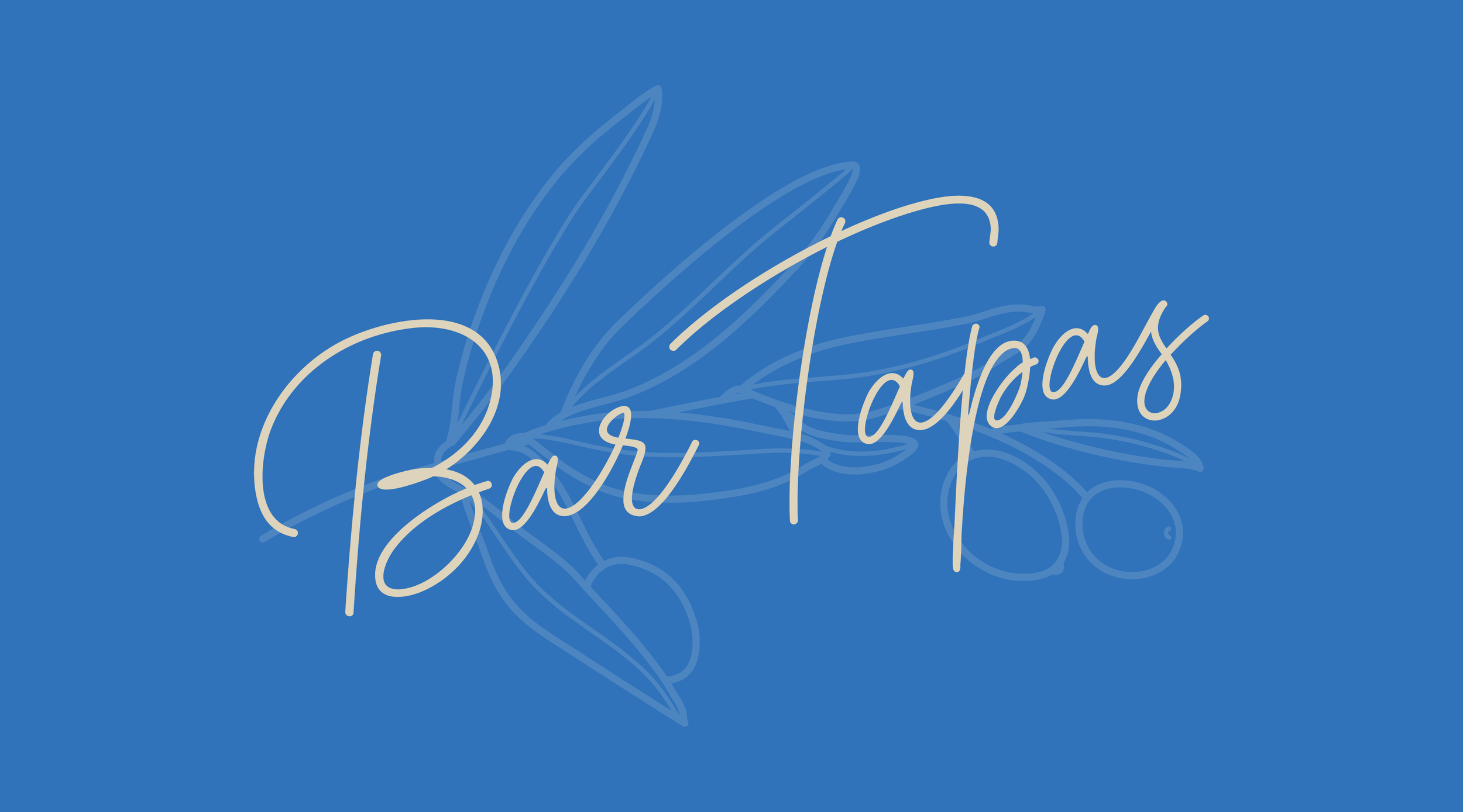
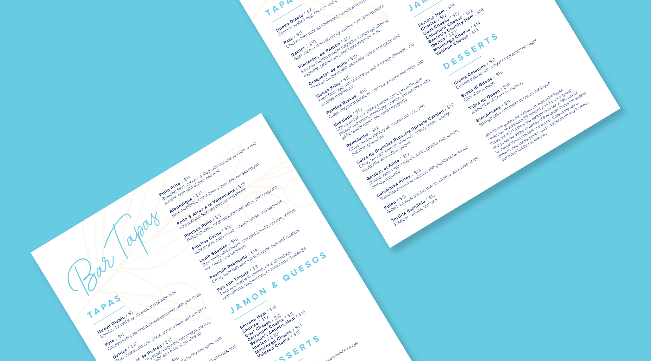
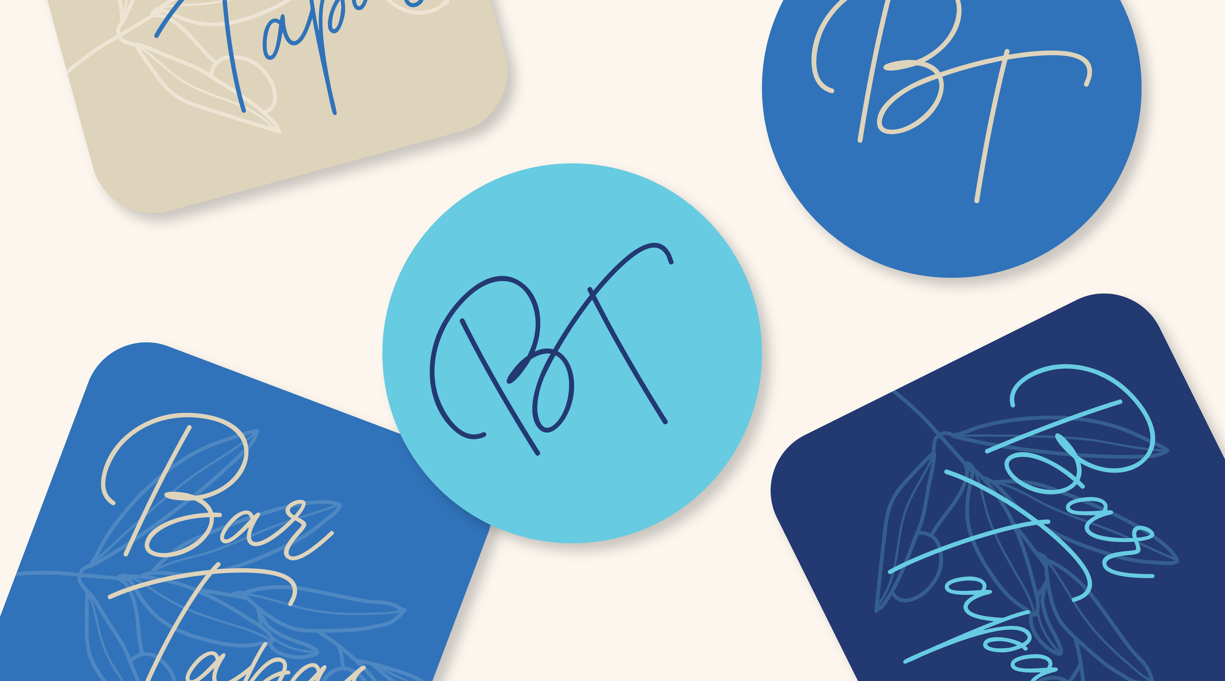
BarTapas is a Spanish tapas restaurant that blends modern sophistication with an eclectic dining atmosphere inspired by the restaurant’s interior finishes and furnishings. The soft blue and cream color palette creates a refined yet welcoming aesthetic, reflecting the upscale but relaxed experience of sharing small plates and conversation.
The logo features a flowing script typeface chosen to emphasize elegance, movement, and a handcrafted feel that mirrors the artistry of tapas cuisine. The elongated letterforms and sweeping curves give the identity a graceful rhythm, allowing the logo to feel both contemporary and timeless. An illustrated olive branch was incorporated into the background as a subtle visual element to reference the importance of olives and Mediterranean ingredients within Spanish culture and cuisine. The delicate linework softens the composition and adds depth without distracting from the typography, helping the overall identity feel polished, airy, and refined.